Alo Utilidades
Alo Utilidades
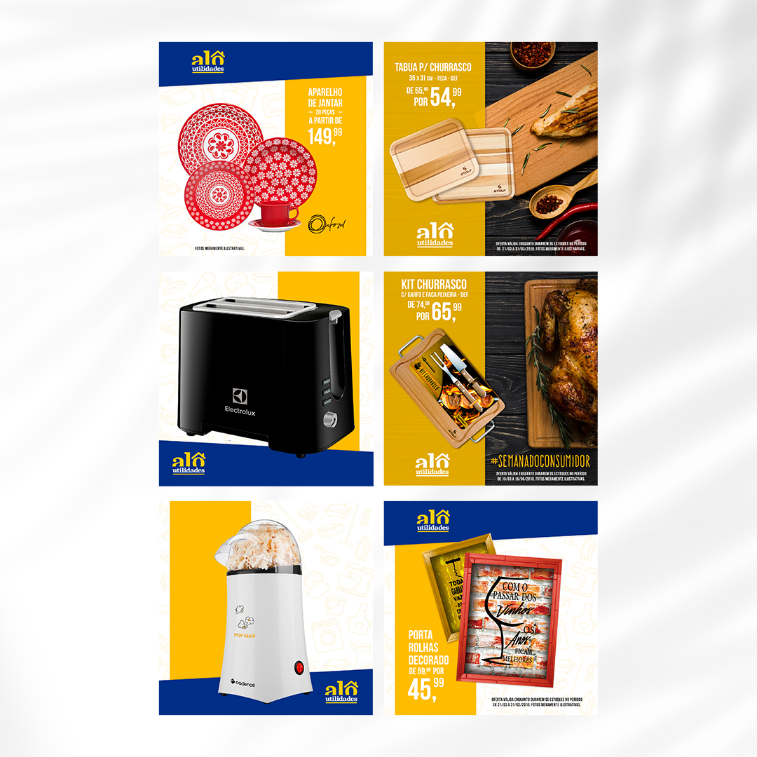
Alô Utilidades is a vibrant retail destination located on a bustling avenue in São Paulo, renowned for its selection of home essentials that combine functionality with aesthetic appeal. This store is a haven for those looking to enhance their living spaces with well-equipped, organised, practical, and beautifully decorated items. By offering an extensive range of products, from kitchen gadgets and storage solutions to decorative items and furnishings, Alô Utilidades caters to the needs of a diverse clientele.
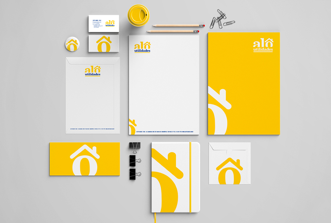
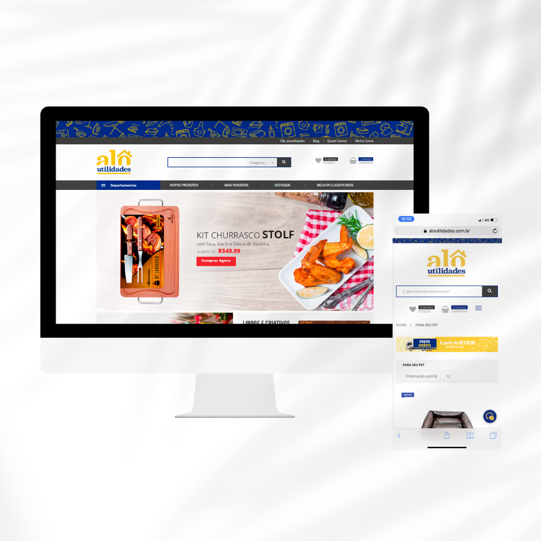
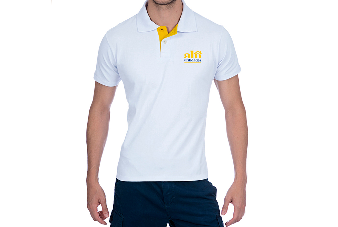
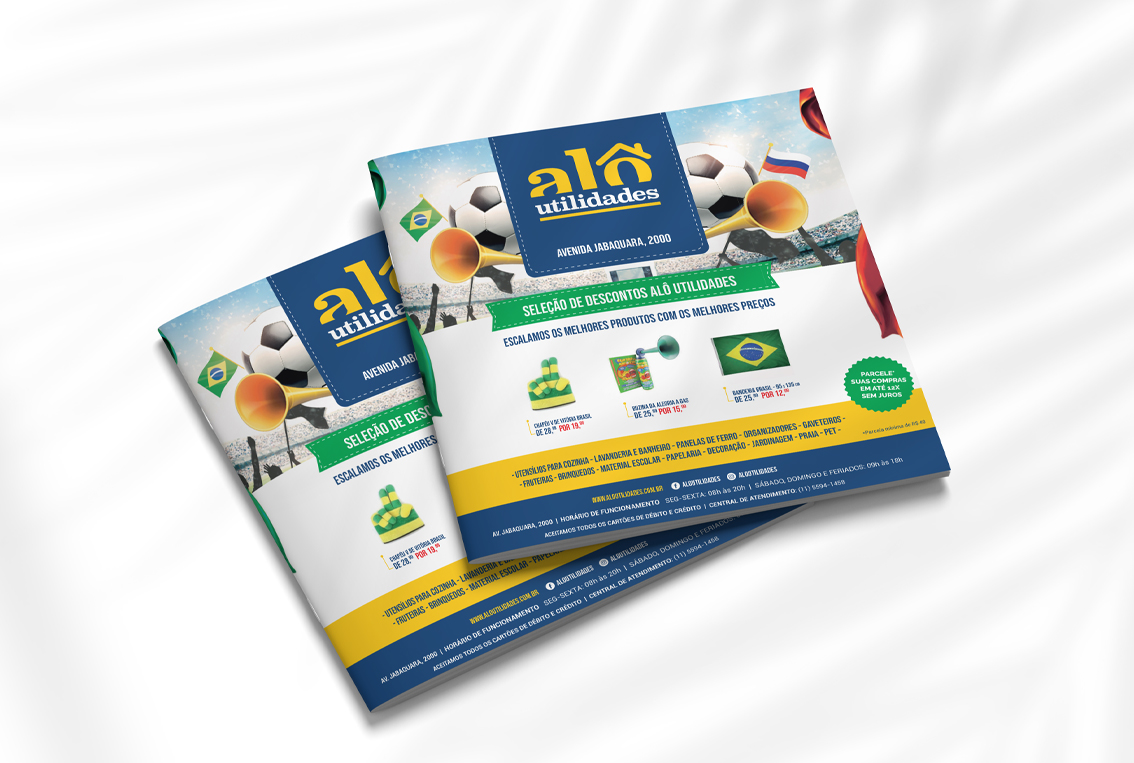
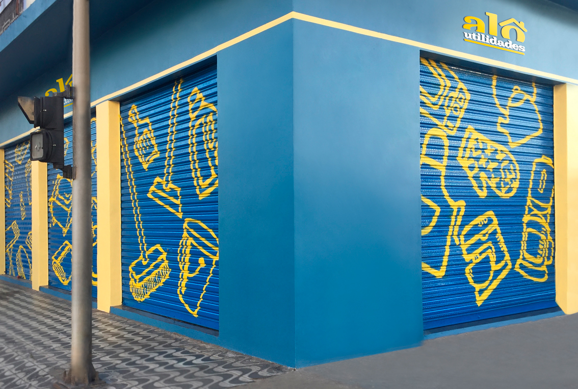
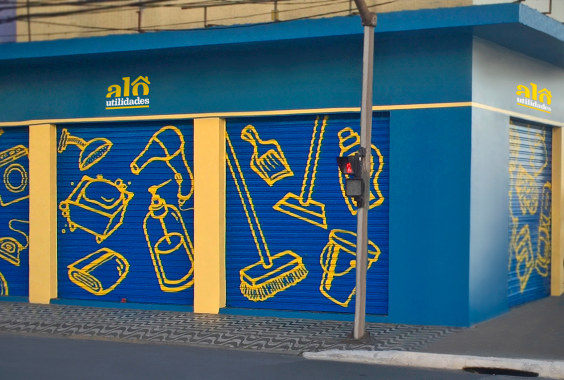
The branding cleverly incorporates a house symbol into the letter ô from Alô, embodying the store’s ethos of “Hello Utilities” in Portuguese. The main color palette of yellow and blue not only represents warmth and reliability but also complements the welcoming and cheerful vibe of the store. These colours are consistently used throughout their branding, from the store’s signage to its online presence, creating a cohesive and instantly recognisable identity that resonates with customers.






Cesar Garwood
June 16, 2019 at 8:45 amGreat site! I am loving it!! Will come back again. I am bookmarking your feeds also.